Art Authority Blog
Number one in Japan
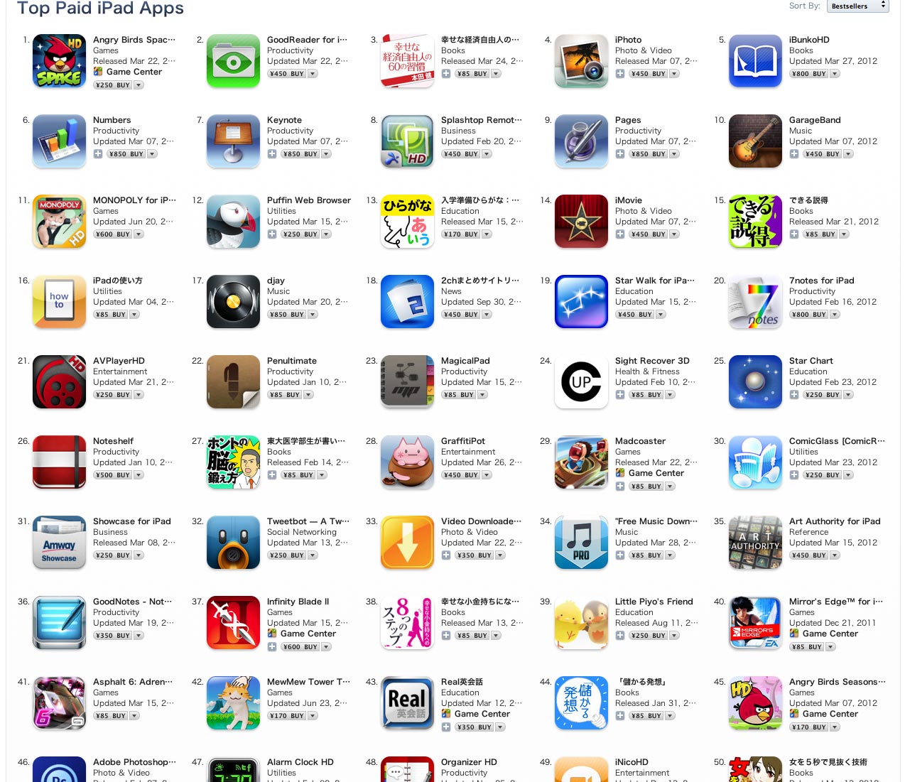
Art Authority has always been very popular in Japan. The new Art Authority for the new iPad has certainly been no exception. Not only has it been the top-selling reference app for the past week, but it recently moved to the number 35 best-selling app overall. #35 may not sound like much, but out of 200,000 iPad apps, it’s pretty meaningful. For instance, as you can see below, that’s 10 better than Angry Birds Seasons (and at nearly three times the price).
They just love Art Authority in Japan! Not to toot our own horn too much, but here’s a recent review:
このアプリは素晴らしいです – ★★★★★
この金額でこれだけの作品をみれるなんて素晴らしすぎます。 もっと値段が高くても良いのではないでしょうか? 唯一欠点としては、一人の画家の作品が多すぎて、見たい作品を探すのが大変なぐらいです。
For those of us who don’t read Japanese, the operative word is
素晴らしい which means “amazing” or “awesome” 🙂 The review’s only complaint: too many works of art!
Real retina vs. non-retina photos
We now have an actual iPad 3 (“new iPad”) with an actual retina display. As expected, the retina display looks amazingly sharp, as does the Art Authority museum and its works on that display. It hasn’t been easy, but we’ve been able to come up with some good photographs comparing things to the way they were before (and still are on an iPad 1 or 2).
As in previous posts, be sure to click on the images for full-size, pixel-by-pixel (or better) resolution.
Here’s the framed version of Botticelli’s Birth of Venus, with the area of focus near the center highlighted.
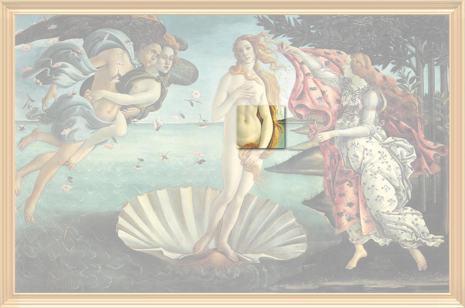
And here are the non-retina (left) and retina versions of the highlighted section. You don’t even need to zoom to notice the difference, for instance the strands of hair between Venus’ arm and her body. If you do zoom, you can easily see each pixel in the non-retina display, but most of the retina pixels are still not visible. If you do want to compare, however, you can just barely make out the pixels at the bottom right of the retina display image.

While we had the camera out and in “macro” mode, here’s one more level of zoom, which literally lets you see each-and-every pixel on both displays. Notice how four retina display pixels fit where there was just one previously. It’s also cool how you can see distinct red, green and blue in the non-retina pixels.
Everything looks so much clearer on the retina display, which is particularly important for the museum-quality experience we’re trying to present with Art Authority. In fact, as we’ve been saying, things look just as clear in Art Authority on the retina display as they do in a museum.
Here’s one more example where you can really see the difference, from a photo of Bernini’s sculpture The Ecstasy of Saint Teresa, again with the area of focus highlighted.

And here are the highlighted left-side rays. Even without zooming, you can see that the rays on the retina display look straight, just as your eye would see them looking at the sculpture. Pretty distinct difference, no?
Upgrading the Art Authority museum
As indicated in previous posts, we’ve been upgrading the virtual museum that our Art Authority app presents on the new iPad’s retina display. It turns out there are an awful lot of components to that museum. You’ve seen some of the overall room upgrades in previous posts, but we thought you might like to see some of the details.
One of the most important components of any museum is its lighting. Here’s the lighting upgrade from the Impressionism room (don’t forget to click on the image itself for the pixel-by-pixel representation).
We’re guessing you can tell which were the old lights and which the new ones. Framing makes a big difference too. Here are the upgraded frames and plaques from the Baroque room:

Wallpaper literally sets the tone for a whole room, in this case the Romanticism room:

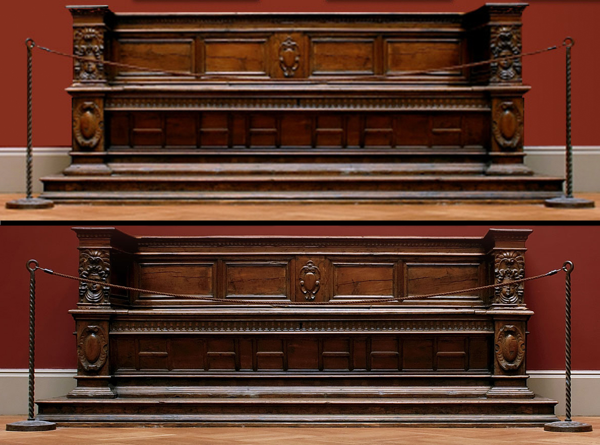
The upgrade to the bench in the Baroque room is so realistic that you can see why it’s roped off for the time being. It would be awfully uncomfortable!
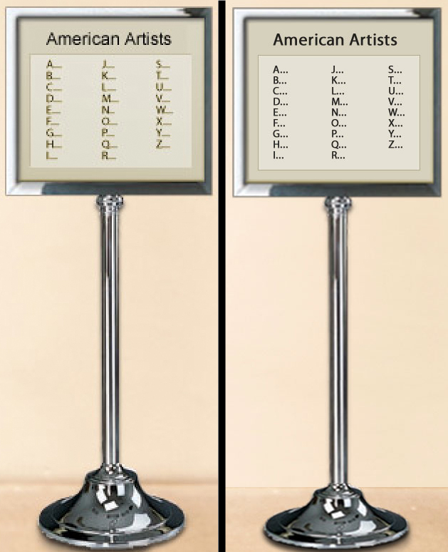
Finally, we’ve made all the “getting around” signs clearer, such as this one from the American room:
How much better, really, is the retina display?
We all know that the new iPad’s retina display, at 2048×1536, is twice as big in each dimension as the previous iPad’s, or four times the total pixels. We also know that, according to Apple, its resolution is so high that your eye can’t distinguish individual pixels at “normal viewing distance.” But how much better, really, is the retina display than the iPad 2’s display?
You’ll have to see it to believe it. That’s the only real answer. Specs and numbers won’t cut it. Best case, put an iPad 2 and an iPad 3 side by side, and compare. But what if you don’t have both? How can we show you the difference here? It’s tricky, since the display you’re looking at probably doesn’t even have as many pixels as a retina display. But we’re going to try.
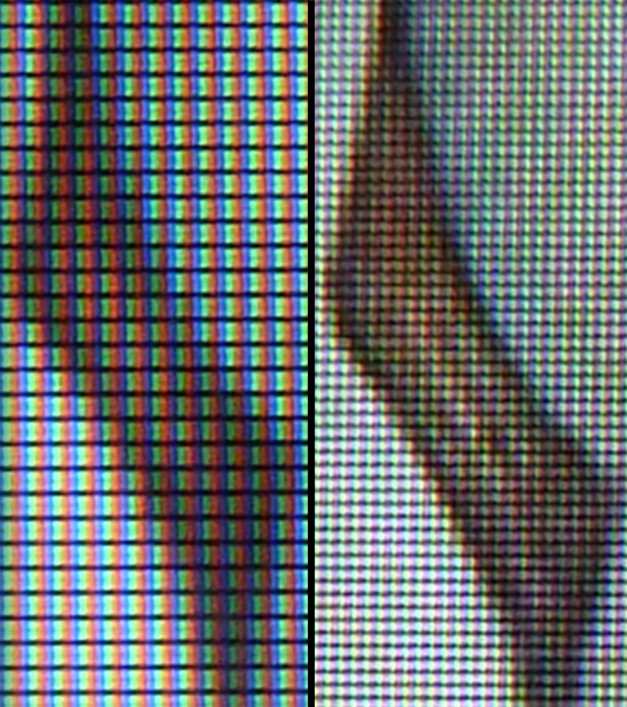
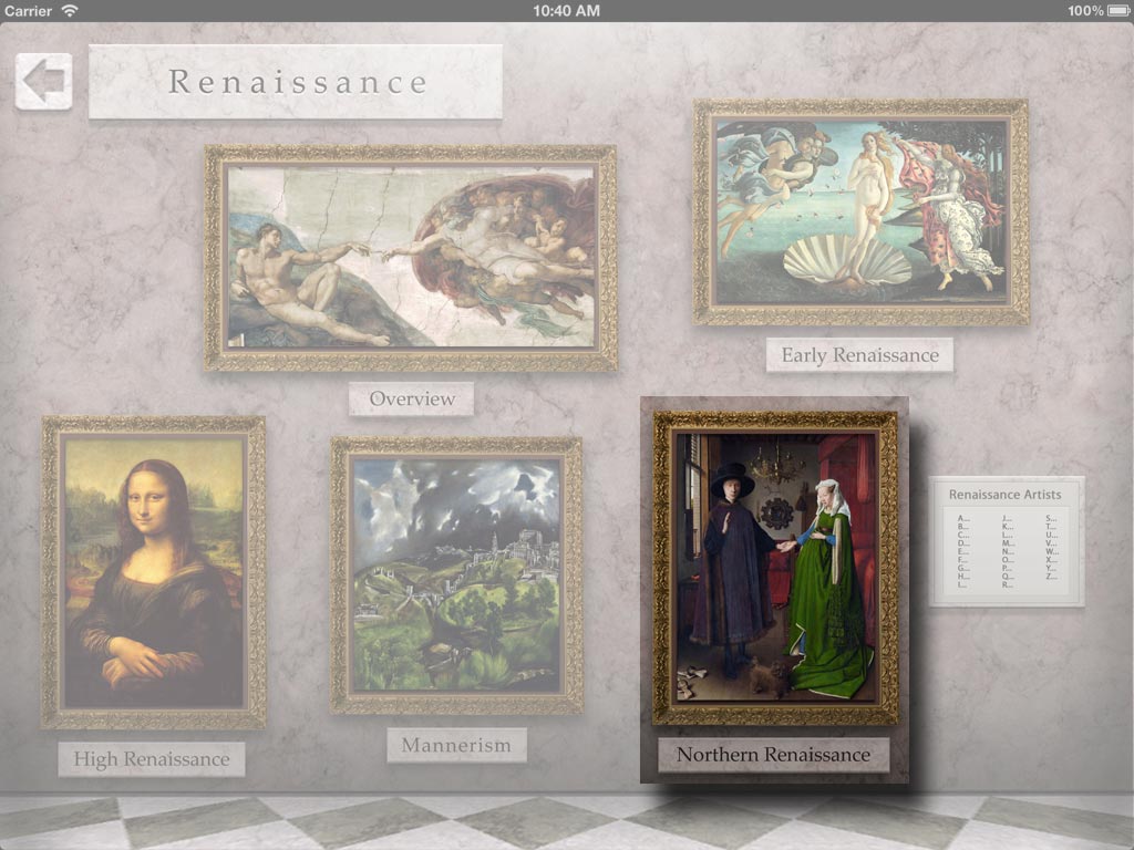
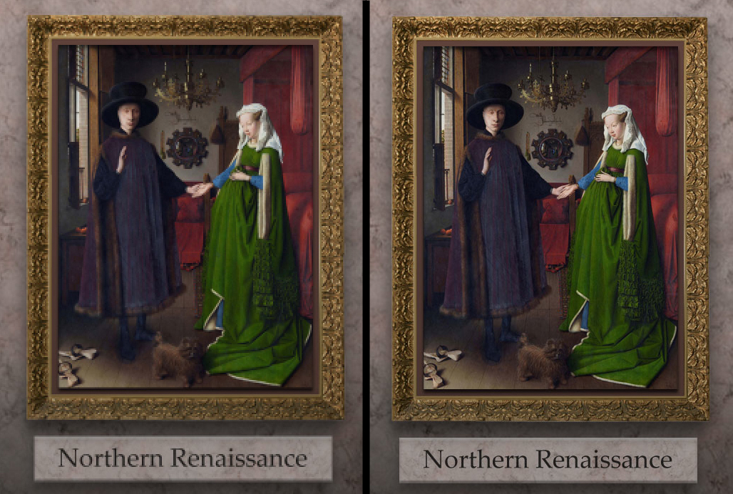
We of course believe that our Art Authority app, newly tuned for the retina display, is the best basis for comparison. Let’s start in its Renaissance room, where we’ve highlighted the framed representation of Jan van Eyck’s Arnolfini Portrait:
Following are pixel-by-pixel images of the highlighted part of that room on both displays. Click on the image to see all the detail (you can also zoom to full screen to see even better, but keep in mind you won’t be viewing pixel-by-pixel in that case). To keep things the way your eye really perceives them, pixels from the iPad 2 display take up 4 pixels in its image. We think you can tell which image is which:
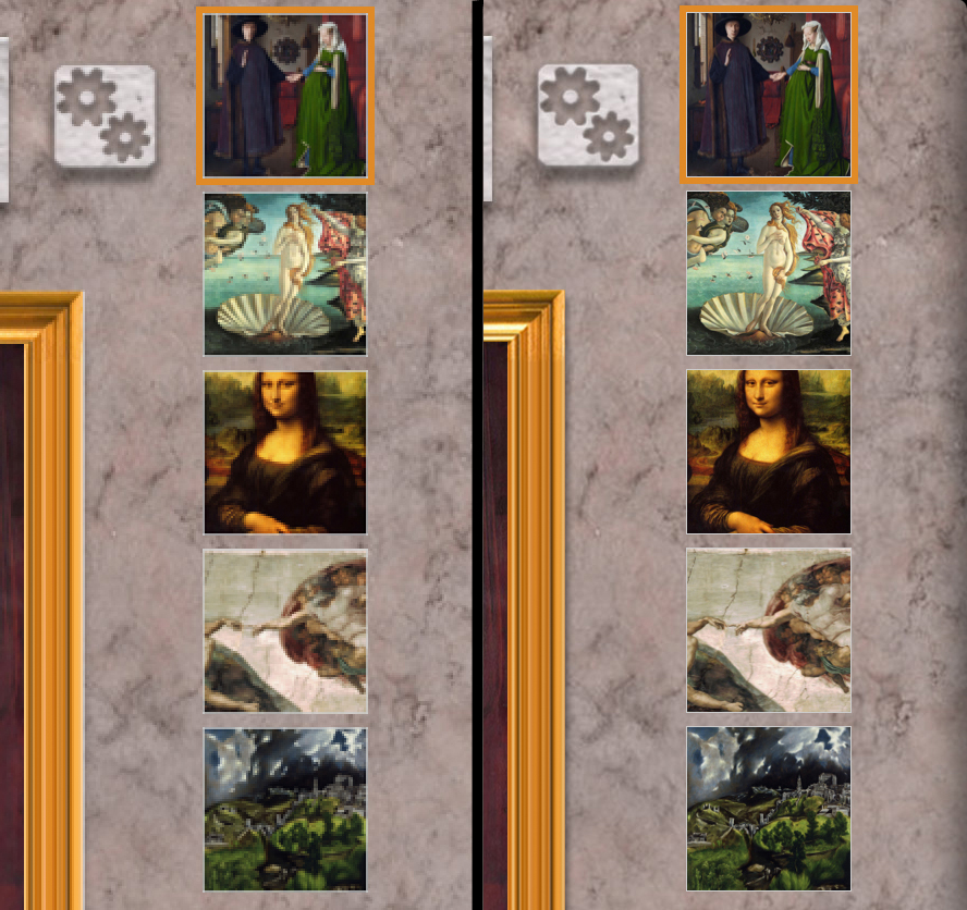
Continuing, here’s the portrait hanging on the wall of the Renaissance Overview room. We’ve highlighted the thumbnails in the key work display that is beside it, along with a bit of its frame.

And here are the side-by-side, pixel-by-pixel comparisons:
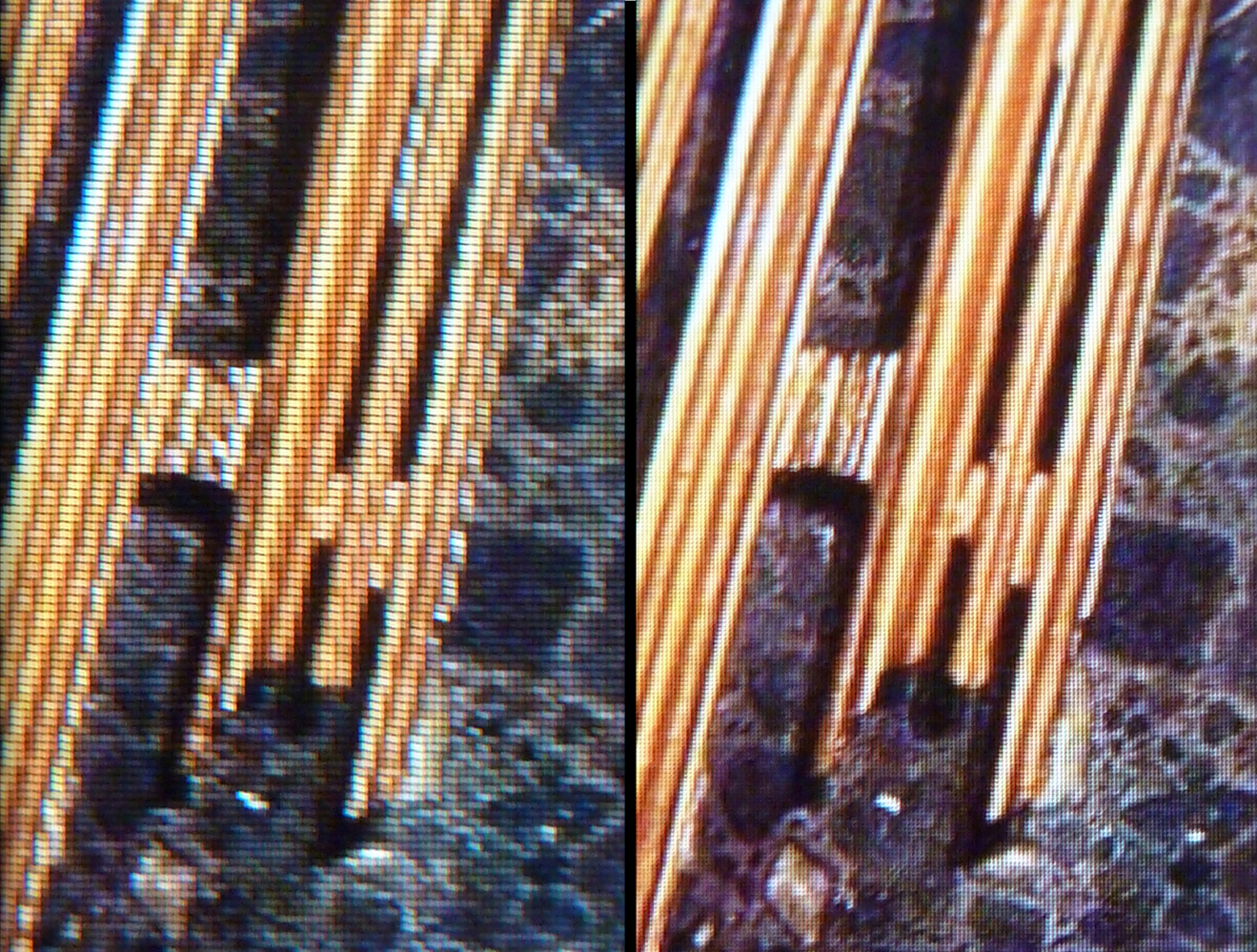
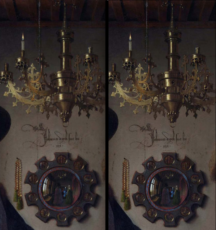
Mona Lisa looks a little different, doesn’t she? Finally, here’s the whole picture, with the oft-analyzed mirror and other interesting items highlighted:

And side-by-side. Check out the artist’s signature and the left portion of the chandelier in particular.
We hope you now get the picture! Let us know what you think, and how our comparison might be improved. Thanks.
As good as in a museum
We think that viewing works of art in the new Art Authority on the new iPad (“iPad 3”) will provide your eyes with just as good an experience as viewing those works in a museum. Of course no app can fully replace the museum experience, and that’s a good thing. Both museums and apps have their place in the art world, and, if you have access to a museum, we think Art Authority will only enhance your experience there. But…
Art apps already beat the museum experience in a number of ways:
- You can view the art from the comfort of you own home, 24 hours a day
- You can view a much larger variety of art, literally from around the world
- You can avoid long road (or plane) trips, noisy crowds, and high prices
- You can search for, explore, and view the art in new ways
Etc. etc. Until the iPad 3’s retina display, however, if you used an app, your eyes knew they were still seeing the art on a computer display. You still saw individual pixels, and that’s not the way the art really looks (certain Pointillism works aside, of course). The main reason to go to art museums is to look at art, and no app could provide you with as good a viewing experience.
Until now. With the retina display, your eyes will see the art just as they would in the museum. As Apple says: “Those pixels are so close together, your eyes can’t discern individual ones at a normal viewing distance. When you can’t see the pixels, you see the whole picture.” Exactly!
Of course we had to enhance the app too, to include rooms, works, and other images that match the 2048 x 1536 resolution of the retina display (which, BTW, is bigger than almost any computer screen). And we had to do so without significantly increasing load times, which is a subject for a whole other post. But we did, and the results are simply amazing.
Amazing enough, we feel, that viewing art in the new Art Authority on a new iPad is now on par with viewing it in any art museum. We’ll have to work on the noisy crowds next 🙂
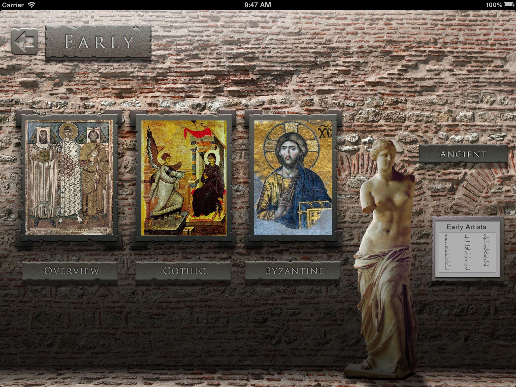
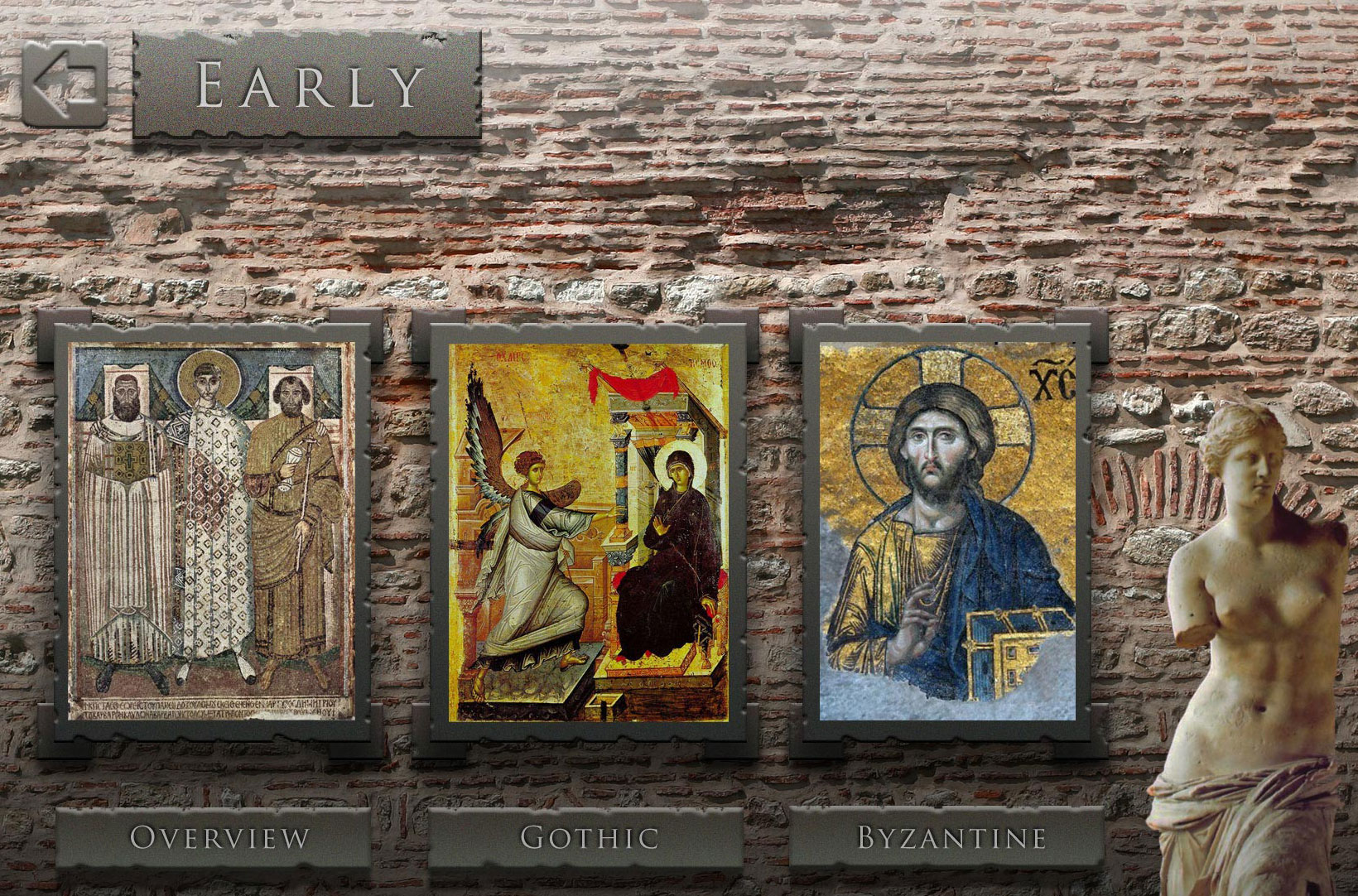
Art on the "new iPad" is going to be even more amazing
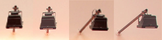
We’ve just submitted a new version of Art Authority for the “new iPad” (aka the iPad 3). If the simulator Apple provides is any indication, the app is going to look even more amazing on it. Here’s a sample to whet all of our appetites. Since the iPad 3’s resolution is bigger than almost any computer screen, we’ve also included a “zoomed in” version so you can better see the actual details. Be sure to zoom in as much as you can, even on the zoomed-in version, and keep in mind that these images have actually been compressed so they don’t take forever to load.